


JOYLAND
Branding for Chef Sean Brock's fast food concept, an ode to the fast food restaurants of yesteryear
-
Develop a distinct and striking visual language that differentiated Joyland from Chef Sean Brock’s more refined dining endeavors which he is nationally associated with.
-
Exude the feeling of the name of the establishment - Joyland - and capture the simple joy that the fast food restaurants of the past would evoke.
-
Visuals
Using a combination of bright, primary colors and simple shapes, an identity was created that echoed confetti to communicate the simple experience of joy.
Copy & Messaging
Copy and Messaging were developed to reinforce the optimistic, joyous spirit the visuals evoked. The messaging was used throughout social as well as at various consumer touchpoints.
An identity was created of bright colors and simple shapes that resembled confetti to communicate the simple experience of joy.
Incorporating the confetti motif, the packaging was designed to work both on-site and to-go due to the pandemic.
Several animations were created to announce the opening of the restaurant and convey its playful, optimistic spirit.
Social was developled in the tone of the brand to highlight the ecclectic offerings that the new concept served.

CLEVELAND BROWNS
Branding and marketing for the Cleveland Browns
-
Create a multi-media campaign that rebranded the Cleveland Browns into a brand that was distinct from other teams and true to who they are.
-
From their straightforward name to the lack of a logo on their helmet, the Browns aren't flashy and there's nothing fancy about them. That's because they are the perfect embodiment of the hardworking spirit and no-nonsense attitude of the region they are from.
-
Visuals
A straight-forward, simple, identity was created that embodied the 'nothing fancy' spirit of the campaign and also differentiated the Browns from the slickly produced feeling that most teams in the NFL exude.
Copy & Messaging
The tagline 'Hardland of America' was created for the campaign which played off of the Ohio region they represented, as well as the gritty spirit of the campaign. Supporting copy in video, print, outdoor, etc. further conveyed this no-nonsense outlook, giving the Browns a distinct brand voice.
Campaign Launch Video
The campaign was officially introduced with the release of a video that was broadcast on TV and shared on social.
The campaign was seeded though social media posts as well as outdoor that teased the arrival of the campaign and start of the season of the Browns.
Copy and Messaging played an important role in establishing a new voice for the team and partnered with the branding to reinforce the ‘nothing fancy’ message.
Outdoor was developed around Cleveland to convey the attitude of the campaign and show how its outlook was about the mentality of the city, not just the team.
On Gameday at the stadium, takeaways for fans were created in the spirit of the campaign.

SKYLINE LODGE
Branding & marketing for a renovated, historic motor lodge in the mountains of North Carolina
-
Develop an identity that synched with the charm of the lodge’s original architecture and foundational interior pieces, while also elevating the look to portray a property that offers guests a refined modern-day experience.
-
Lean into the spirit that the name 'motor lodge' and the property's architecture evokes to differentiate it as a unique alternative to the more typical 'mountain retreat' luxury properties that dominate the surrounding area.
-
Visuals
A mid-century modern aesthetic was chosen as the perfect match for the aesthetics and history of the lodge, and its playfulness matched the more casual vibe the property was seeking to create.
Copy & Messaging
Copy and Messaging was developed to re-inforce an easygoing vibe, giving the brand voice a bit of a 'cheeky' edge, further distancing itself from it's more stoic and formal competition.
A logo was developed in a mid-century vibe to immediately give the viewer a sense of the style of the property and clearly differentiate it from the more proper hotel options that were common in the area.
Initial marketing efforts used the logo as well as mid-century illustrations of the property to stand out among the traditional property photos employed by competitors.
A character was developed to be selectively used in the branding as well as in social marketing to showcase the brand's personality.

Rather than a 'typical' in-room compendium for guests, a folding map was created to give guests pertinent info about the property in a spirit that was distinctly on brand.
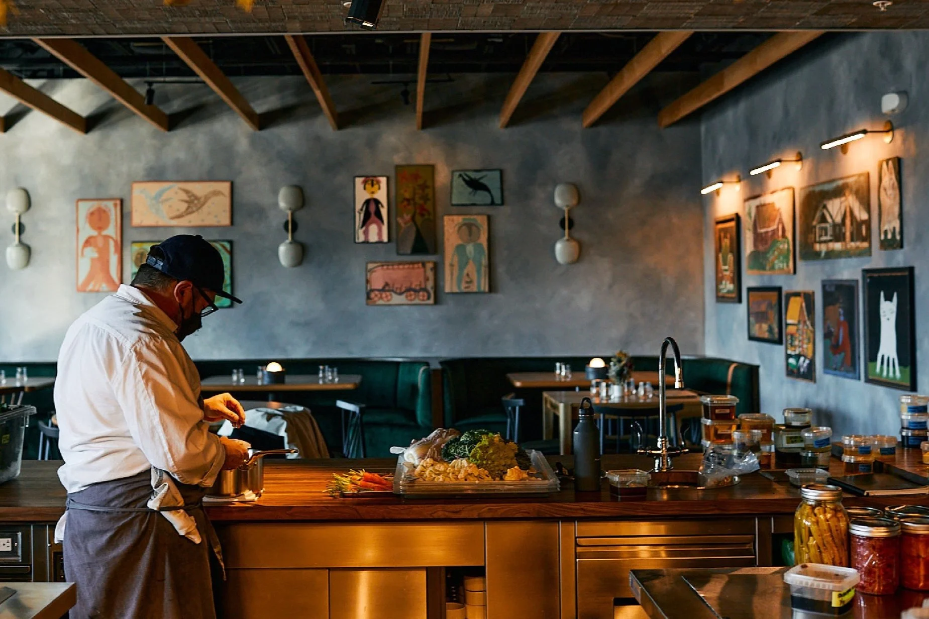
AUDREY
Branding for Chef Sean Brock's flagship restaurant, an ode to Southern Appalachia
-
Develop branding that felt at home with the avant-garde, modern Southern cuisine being served and the modern - yet folky - space it was being served in.
-
Create the the branding in a true 'folk art way', in order for it exude both the aesthetics and the spirit of the Southern Appalachian folk art that adorned the restaurant's walls.
-
Like the many folk artists that adorned the walls whom used whatever materials they had around them to create, the same technique was applied to the various ingredients that Chef Brock would be using in the restaurant’s cuisine.
Prints were created by hand with the ingredients through the ancient Japanese printing method called ‘Gyotaku’, giving the branding a true folk art sensibility that matched its surroundings in look as well as spirit.
Named after Chef Brock's grandmother Audrey, her signature was taken from her old social security card and used as the logo, creating a hand-done, natural feel.
The hero of the branding were prints created though an ancient Japanese printing method called ‘Gyotaku’, in which the ingredients Chef Sean Brock used in his cuisine were inked and transferred to paper.
The prints made of the ingredients created a distinct look that was both modern and folksy, attributes the restaurant’s interior and design were trying to exude.
A folk-art interpretation of the exterior of the building where the restaurant resides was also created. The iconic structure signals to the guest upon arrival that a special experience is about to take place.

MOD SQUAD MUTT
Branding, packaging, and marketing for dog treats that help foster kids and homeless pets
-
Bring to life and market a product in a crowded category, and educate consumers about it's purpose of helping the less fortunate.
-
Differentiate the brand visually by leaning into the 'groovy' 70's music vibe of it’s name and it’s Nashville home. Differentiate the brand in terms of messaging by celebrating the 'underdog', a spirit that applies to both the animals and kids the treats help.
-
Visuals
A groovy vibe was created using both music iconography (guitars & guitar picks) with dog iconography. The bright colors and bold graphics created a dinstinct look and feel for the branding that took advantage of the popularity of its Music City roots while also making it stand out in a crowded field.
Copy & Messaging
The tagline 'TREAT GOOD' was developed as the perfect incapsulation of the giving back spirit of the brand and nodded to the healthy ingredients the treats were made with. With that as the foundation, copy for videos, print ads, social, etc. were developed to reinforce hte message of embracing the 'underdogs'.
The branding and packaging were created to stand out in a crowded industry as well as to feel more upscale and be considered for gifts rather than just a utility which many pet products are.
The tagline 'TREAT GOOD' was developed as the perfect encapsulation of the giving back spirit of the brand and nodded to the healthy ingredients the treats were made with.
Online, visuals and messaging came together to tell the story of a company that was all about helping others, in a unique, ‘groovy’ way that still felt on-brand.
Social engagement concepts were created to reinforce the brand’s Music City roots, and carve out a unique space for the brand to live in within the pet food category.